The Perils of Color Printing
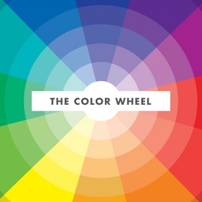
Selecting a color has not always been something that was a few clicks away. Color used to be collected from pigments of the earth and then died into fabric. You had to collect the berries to make the purple-ish/reds or dirt to get a brown. Color, binds the creative realm together be it graphic design, photography, interior design, textile design, transportation design etc. Of course you can take pictures in black & white or make a logo black with greys but the colors are where we can experience emotion and that emotion ties us to the image, art, design or product. The colors bring the brand, the curtains, the rug, the subject, the foreground or the background to life. In order to make your color picking easier there are several different color relationships that will help you along the way.
- Primary Colors. Primary colors are the basis of the color spectrum. With these three colors, you can create any other color in the spectrum. Red, Yellow & Blue. This is a bold and powerful color scheme when used together.
- Secondary Colors. Secondary colors are made by mixing two of the primary colors together. They lie opposite of the primary colors on the color wheel. Green, Violet & Orange. These colors are very bold like primary colors, when used together.
- Tertiary Colors. The colors in–between the secondary & primary colors are what make up the tertiary colors. You can create these colors by mixing one primary color and one secondary color. Using tertiary colors as a color scheme is very bright and vibrant.
Once a color is determined, it can be printed either as a four color process (CMYK) or as a custom Pantone™ specific color.